OV
5.0评论日期:Mar 16, 2026
The course works well for learners who have basic knowledge of Python and Pandas, and want to move into visualization.
This beginner-friendly course introduces learners to Seaborn in Python, a powerful library built on Matplotlib for statistical data visualization. Designed with a structured, hands-on approach, the course guides learners from foundational relational plots to advanced categorical and statistical visualizations. In Module 1, students will construct and interpret scatter plots, line plots, and faceted relational charts to analyze trends and relationships in data. Using Bloom’s Taxonomy verbs, learners will differentiate patterns, apply semantic mappings, and evaluate multi-variable relationships effectively. In Module 2, the focus shifts to categorical and statistical visualizations. Students will design and analyze boxplots, violin plots, barplots, countplots, swarmplots, stripplots, and catplots, gaining the ability to summarize distributions, measure central tendencies, and visualize confidence intervals with precision. By the end of this module, learners will be able to apply Seaborn’s figure-level functions to create meaningful, multi-faceted insights from categorical datasets. Through practice-based learning, quizzes, and structured lessons, learners will not only visualize data but also evaluate and communicate insights clearly, equipping them with essential data visualization skills in Python using Seaborn.
OV
The course works well for learners who have basic knowledge of Python and Pandas, and want to move into visualization.
SM
Learners report that after taking the course, they can effectively explore datasets and tell data stories through graphs, which they find valuable for projects and presentations.
LL
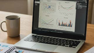
Plots like bar charts, box plots, heatmaps, and pair plots were explained step by step.
GK
Each plot’s customization options were explained in a simple way.
IC
Examples help in understanding how visualizations represent data patterns, though they are mostly basic.
MV
I liked how Seaborn is taught alongside real datasets, which helps in understanding how visualizations are used in actual analysis.
RA
If you’re just getting started with Python data analysis, this is a decent starting point. It walks through the essential plotting techniques without overwhelming you with too many advanced concepts.
CC
I liked that the course didn’t assume deep Python knowledge. Each concept built on the previous one, so I never felt lost.
PT
It’s useful for students and professionals who want to improve data storytelling skills.
JV
The integration of Seaborn with Python libraries such as Pandas and Matplotlib is briefly shown, which helps beginners understand the workflow.
JJ
The course moves logically from simple plots (like line and scatter) to more advanced categorical and statistical visualizations.
DD
Seaborn plus Matplotlib combination helps learners grasp both convenience and customization.
显示:20/21
Seaborn with Python: Data Visualization for Beginners” is a well-structured and beginner-friendly course that clearly explains how to create meaningful and visually appealing data visualizations using Seaborn. The instructor starts from the basics, making it easy for learners with limited prior experience to understand concepts like plots, styling, and data relationships. Practical examples and hands-on demonstrations help reinforce learning, and the step-by-step approach builds confidence in using Seaborn effectively with real datasets. Overall, it’s a valuable course for anyone looking to strengthen their data visualization skills in Python.
Learners report that after taking the course, they can effectively explore datasets and tell data stories through graphs, which they find valuable for projects and presentations.
I liked how Seaborn is taught alongside real datasets, which helps in understanding how visualizations are used in actual analysis.
I liked that the course didn’t assume deep Python knowledge. Each concept built on the previous one, so I never felt lost.
Combining Seaborn with pandas was super useful — I could preprocess data and plot it smoothly without switching contexts.
The course works well for learners who have basic knowledge of Python and Pandas, and want to move into visualization.
Basic plotting concepts are explained clearly, making it easy to understand even with limited Python experience.
The course shows how Seaborn works seamlessly with Pandas dataframes, which is useful for real data analysis.
Seaborn plus Matplotlib combination helps learners grasp both convenience and customization.
It’s useful for students and professionals who want to improve data storytelling skills.
Plots like bar charts, box plots, heatmaps, and pair plots were explained step by step.
Very practical, with lots of examples covering real datasets and common chart types.
The ‘Seaborn with Python: Data Visualization for Beginners’ course is a very helpful introduction to creating data visualizations using Python. The lessons explain how to use Seaborn to build clear and attractive charts, and the examples make the concepts easy to understand. It’s well suited for beginners who want to improve their data analysis and visualization skills.
If you’re just getting started with Python data analysis, this is a decent starting point. It walks through the essential plotting techniques without overwhelming you with too many advanced concepts.
The integration of Seaborn with Python libraries such as Pandas and Matplotlib is briefly shown, which helps beginners understand the workflow.
The course moves logically from simple plots (like line and scatter) to more advanced categorical and statistical visualizations.
Covers a wide range of plots (categorical, distribution, regression visuals) without overwhelming you early on.
Some parts moved quickly if you’re brand-new to Python, but going back over exercises reinforced the ideas.
Examples help in understanding how visualizations represent data patterns, though they are mostly basic.
Each plot’s customization options were explained in a simple way.