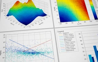
EDUCBA
Advanced Data Visualization with Matplotlib Mastery
EDUCBA

Advanced Data Visualization with Matplotlib Mastery

EDUCBA

位教师:EDUCBA

包含在 Coursera Plus

深入了解一个主题并学习基础知识。
1 周 完成
在 10 小时 一周
灵活的计划
自行安排学习进度
深入了解一个主题并学习基础知识。
1 周 完成
在 10 小时 一周
灵活的计划
自行安排学习进度

您将学到什么

  • Apply paths, transformations, and axes customization for precise control.

  • Use advanced colormaps, scaling, and annotations to enhance clarity.

  • Build 3D and specialized plots to communicate complex, multi-dimensional data.

要了解的详细信息

可分享的证书

添加到您的领英档案

最近已更新!

September 2025

作业

12 项作业

授课语言:英语(English)

了解顶级公司的员工如何掌握热门技能

Petrobras, TATA, Danone, Capgemini, P&G 和 L'Oreal 的徽标

积累特定领域的专业知识

本课程是 Matplotlib: Python Data Visualization & Wrangling 专项课程 专项课程的一部分
在注册此课程时,您还会同时注册此专项课程。
  • 向行业专家学习新概念
  • 获得对主题或工具的基础理解
  • 通过实践项目培养工作相关技能
  • 获得可共享的职业证书

该课程共有4个模块

This module guides learners through advanced concepts in Matplotlib, focusing on creating and manipulating paths, applying visual effects, and mastering the transformation framework for precise control over plot elements. Learners will explore complex path structures, use path effects for enhanced visual styling, and work with various coordinate systems—including blended transformations—for dynamic and context-aware positioning in data visualizations.

涵盖的内容

7个视频3个作业1个插件

This module explores advanced customization and application of colors in Matplotlib visualizations. Learners will master techniques for defining custom colors, creating and modifying colorbars, designing colormaps for specific datasets, and applying various normalization and scaling methods to enhance data interpretation. Special attention is given to selecting colormaps that align with data characteristics and ensuring perceptual accuracy through lightness analysis.

涵盖的内容

11个视频3个作业

This module focuses on enhancing Matplotlib visualizations with advanced text formatting, legends, annotations, and creative connection styles. Learners will explore methods to position and style text, apply annotations in both Cartesian and polar coordinates, use advanced connection patches, and create dynamic effects such as zoom indicators between plots. Through these techniques, learners will be able to add clarity, context, and visual appeal to their data presentations.

涵盖的内容

12个视频3个作业

This module explores Matplotlib’s advanced axes customization and specialized plotting capabilities. Learners will master the Axes Artist toolkit for creating floating axes, parasite axes, and anchored artists, while also integrating LaTeX rendering, custom grid layouts, and multi-page PDF exports. The module further extends into 3D plotting, where learners will create and customize three-dimensional lines, bars, and coordinate systems to visualize complex datasets with clarity and precision.

涵盖的内容

14个视频3个作业

获得职业证书

将此证书添加到您的 LinkedIn 个人资料、简历或履历中。在社交媒体和绩效考核中分享。

位教师

EDUCBA
EDUCBA
427 门课程124,639 名学生

提供方

EDUCBA

从 Data Analysis 浏览更多内容

人们为什么选择 Coursera 来帮助自己实现职业发展

Felipe M.
自 2018开始学习的学生
''能够按照自己的速度和节奏学习课程是一次很棒的经历。只要符合自己的时间表和心情,我就可以学习。'
Jennifer J.
自 2020开始学习的学生
''我直接将从课程中学到的概念和技能应用到一个令人兴奋的新工作项目中。'
Larry W.
自 2021开始学习的学生
''如果我的大学不提供我需要的主题课程,Coursera 便是最好的去处之一。'
Chaitanya A.
''学习不仅仅是在工作中做的更好:它远不止于此。Coursera 让我无限制地学习。'
Coursera Plus

通过 Coursera Plus 开启新生涯

无限制访问 10,000+ 世界一流的课程、实践项目和就业就绪证书课程 - 所有这些都包含在您的订阅中

通过在线学位推动您的职业生涯

获取世界一流大学的学位 - 100% 在线

加入超过 3400 家选择 Coursera for Business 的全球公司

提升员工的技能,使其在数字经济中脱颖而出

常见问题